What's in a name? Behind the branding of Wismut Labs
This is the first post of a multi-part series about developing the brand identity for Wismut Labs.
Wismut Labs is a technology innovation company made up of individuals who are experts in their respective fields. What makes us unique is the fact that we come from diverse backgrounds, and chose to come together because of our shared values and complementary skillsets. We are definitely not your run-of-the-mill technology firm, and I wanted our brand identity to reflect that.
Let’s talk about us
There were a couple of questions that needed answers to before we could proceed with this whole brand identity thing:
- Who exactly are we?
- What value can we bring to our clients?
Everyone in the team had already known or worked with at least 1 other person before joining, so in that sense, the uncertainty of a new person joining the team was greatly reduced. It wasn’t “culture fit” that brought us together, it was the fact that despite all of us being very different people, our values aligned. We believed in being respectful and transparent. And we all had an appreciation for software engineering excellence.
All of us had been through the wringer in previous jobs, some more times than others, so nobody had any misconceptions about what technology innovation entailed. We knew very clearly how much hyperbole was being thrown around because each and every one of us has implementation experience in our respective areas, from distributed systems to devops.
We overestimate short-term effects and under-estimate long-term implications of emergent technological change.
— Amara’s Law
Hence the most valuable thing we could offer to clients is what I’d like to term realistic innovation. Because of our familiarity with implementation, we are very aware of what can or cannot be done based on the context each client operates in. Some clients don’t have strong engineering teams, some have limited capabilities in terms of data analytics, and all these have to be taken into account when we want to introduce innovation initiatives.
So now that we’ve established what Wismut Labs is, we can talk about how to encompass all that in a brand identity.
A brief origin story
The team was very fond of the Bismuth crystal and how it looked. Bismuth is number 83 in the periodic table and its crystals have a spiral, stair-stepped structure, which conveyed a feeling of depth. Quite apt since deep learning was one of our core competencies.
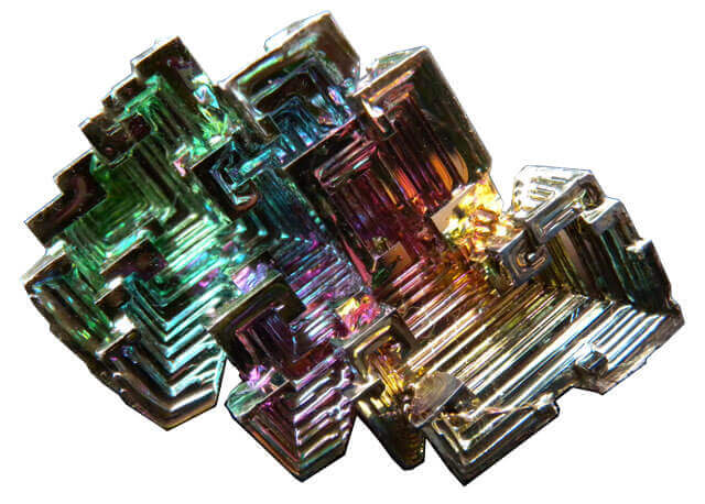
The origins of the word “Bismuth” came about from the latinisation of the old German word “Wismut”. It just so happens that the German word “Wissen” means “to know” and
What’s your personality colour?
Colours can be broadly split into warm and cool colours. We often associate technology with machines, made of cold, smooth metal, and futuristic colour palettes are often cool, accents of neon blues and greens on black are pretty popular.
But we believe that the role of technology is to augment human capabilities, not replace them. Our colour palette is primarily grey-scale, with orange as the main accent colour. Dark on white allows us to emphasise clarity, and let the orange really pop on things we wanted to bring attention to.

Analogue first
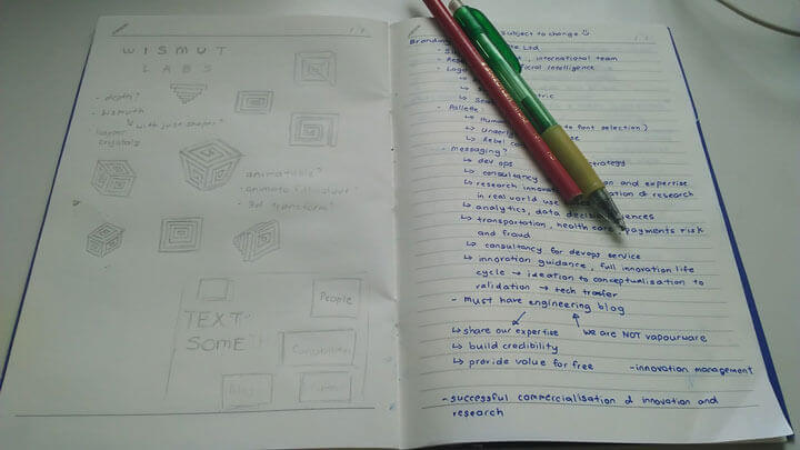
The concept of branding isn’t complicated. At the heart of it, it is simply a mark to differentiate ourselves from everyone else. We now refer to these marks as logos. One thing that I always keep in mind is what Paul Rand said when he came up with the design for the NeXT logo, that ideally, a logo “possesses the promise of meaning and pleasure of recognition.”
Our logo would start out as nothing more than a graphical symbol associated with Wismut Labs, but we would have to infuse meaning into that symbol through the work that we do and what we stand for. That being said, the process began with pencil sketches.
A symbol of us
There were a few criteria I set out to achieve for the logo:
- It had to scale well
- It had to work in both grey-scale and colour
- It could be re-interpreted without losing its original form
Of all the sketches, the one right in the middle, where the perspective of the logo was above eye-level, was the most appealing. So that was the one I translated into a vector image using Sketch.

For the logo colour, I picked a blue so warm it bordered on purple, which complemented the main accent colour rather well. Another advantage of the three-tone colour scheme was the ease at which the logo’s colour could be changed if necessary, without losing its base form.
The three-dimensionality of the logo provided the option of using perspective to modify the logo while keeping its original form. In places where the three-dimensional logo wouldn’t work well, e.g. company stamps which had to be two-tone, it was possible to shift the perspective to be directly on top of the logo.


Till next time…
This ends the first part of the story behind Wismut Labs brand identity. The second part will cover the application of this brand identity to our web presence as well as printed matters.
Read Part 2: Designing for the web in the browser
Read Part 3: Building for cross-browser compatibility